
Spaceship’s homepage search was the front door for two very different actions — registering a domain and transferring one in. Both funnelled through the same input field, separated only by a dropdown most users never noticed. I led the redesign end to end: research, process, design, and delivery across four teams and eleven people over 2.5 months.
The problem
A single search bar handled both domain registration and domain transfer. A dropdown labelled “I want to…” switched between modes — silently, with no visual change to the input itself. Users didn’t know which mode they were in, and every research session confirmed it.

The process
Four teams in the room from day one: Product Platform, Design System, Brand, and Research. Eleven people. A shared roadmap with milestones, research bookending the design work—not added at the end to validate decisions already made.

I led the process and the roadmap while also being one of the designers. That dual role was intentional—when you’re in the Figma file yourself, you have a different kind of authority in the conversations.
Research
First research phase ran on the live product, in the browser. No prototype comfort blanket. The signal was clean—six issues ranked by severity, the #1 problem affecting every participant.
”Search or transfer a domain” placeholder creates confusion — users don’t understand the difference between search and transfer, especially with the dropdown open.
Issue #1 from usability testing — confusion between search and transfer affected every participant. Full report →
Three proposals, one conversation
Three designers—myself, David, and Mafalda—each took our own direction. Same brief. The goal wasn’t to pick a winner but to generate a real conversation.
Three directions, same brief. The conversation that followed was one of the best I’ve been part of.
The design critique was structured: async analysis first, then a live discussion. No presenting, no defending—just talking about the work. I took everything from that room and designed the final component. Not by committee—by synthesis.
The decisions that mattered
The core insight: registration and transfer are two fundamentally different intentions. They shouldn’t share a mode.
The new component starts with a visible toggle—Register or Transfer—above the search bar. Switch to Transfer and the whole bar transforms: different placeholder, different CTA, different secondary action. Bulk transfer lives as a secondary action inside Transfer mode—accessible but not accidentally triggerable, with a modal handling up to 500 domains and CSV upload.
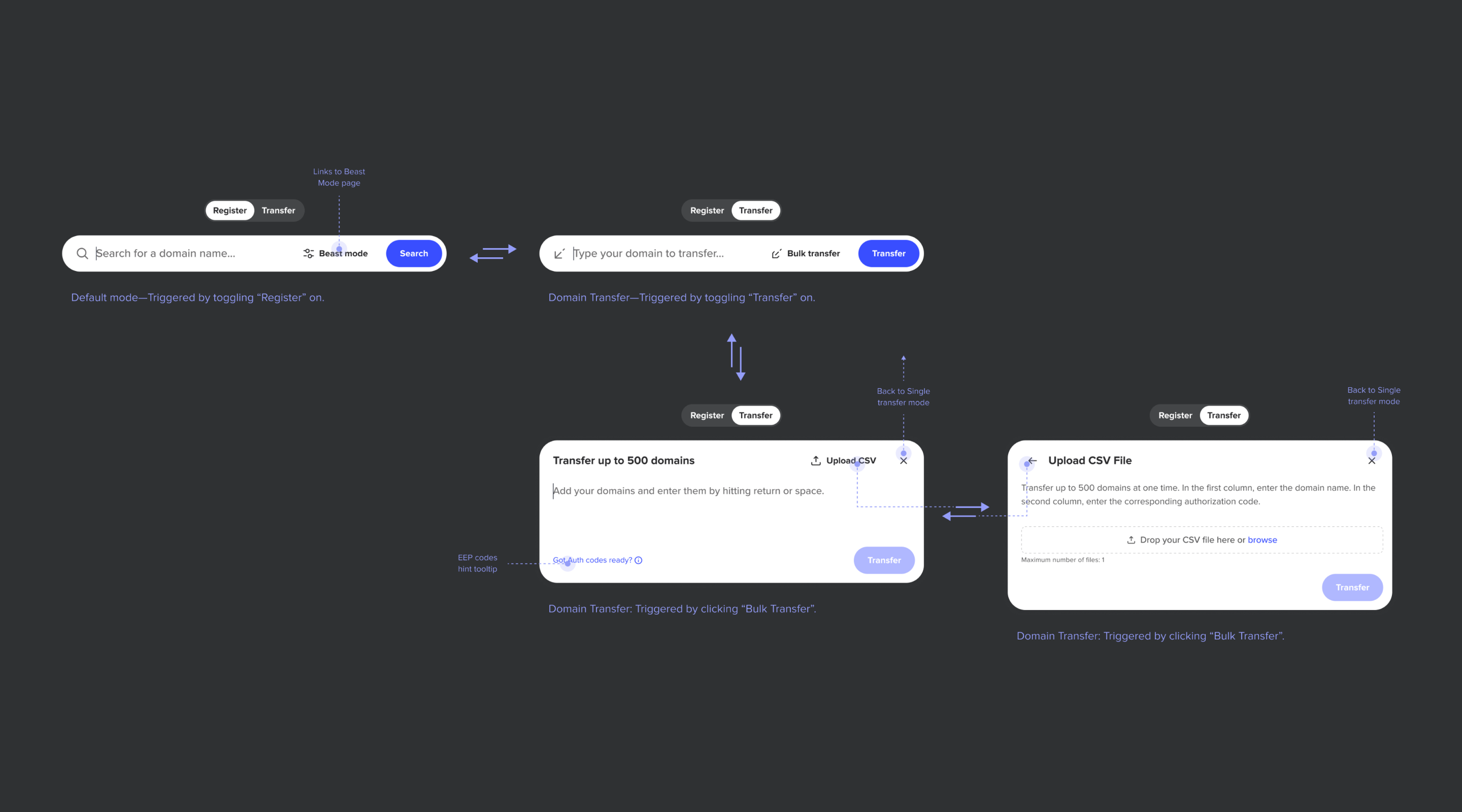
One late decision worth naming: the refined prototype had the toggle living inside the component, visible only after clicking in. Cleaner, more elegant. But we recognised the problem—we’d spent the whole project removing hidden modes, and here we were introducing a subtle version of the same thing. We moved the toggle outside. Always visible. Sometimes the most honest design decision trades a bit of elegance for a lot of clarity.
What the data showed
The design shipped April 2024. Weeks later, the BI team flagged an anomaly: widget interactions dropped ~95%. It wasn’t a problem—it was the design working as intended.
Monthly Widget Interactions
The April cliff marks the product change.
The old widget was one click from the homepage—most interactions were accidental. The new design put transfer behind an intentional toggle and bulk transfer behind a second deliberate action. Only users who actually wanted to transfer were reaching the widget.
Transfer success rate: ~5% → 21%. Four times higher. Volume down, intent up. The full data breakdown tells the rest.
Takeaways
Research before and after, not just before. Two rounds of usability testing — one on the live product, one on the prototype — kept the team honest. The first round surfaced the problems; the second confirmed we’d actually solved them.
Competing proposals beat consensus. Three designers working independently produced a richer conversation than any brainstorm could. The final design wasn’t a compromise — it was a synthesis that none of us would have reached alone.
Clarity over elegance. The toggle could have been sleeker tucked inside the component. We chose visible over clever — because the entire project was about making hidden things visible.
Fewer interactions can mean better outcomes. A 95% drop in widget interactions looked like a disaster until you read the transfer success rate. Removing accidental clicks revealed the real signal: the people who meant to transfer were now succeeding four times more often.