
The problem
The front door was broken
The design was the reason. Take a look at what it was like below.

Several problems with that input. Take a careful look… The idle state “said” searching and transferring could be done in the same place—the placeholder text and the buttons suggested it. Users couldn’t start interacting with it without scratching their heads… What was the action? Transfer? Search? Which one is primary? What would happen when you hit enter?
It got even more confusing when in focus. A dropdown appeared with two options: “Search or Transfer” and “Bulk transfer.” A couple of problems with this… First, single transfer and bulk transfer are conceptually related but appeared as if they were opposites. Second problem—an affordance one—they looked like links, not mode selectors.
What did research say?
The first round of usability testing ran on the live product, in the browser. Six issues surfaced, ranked by severity. One of them affected every single participant—that’s the one this story follows. The other five are in the report.
“Search or transfer a domain” placeholder creates confusion—users don’t understand the difference between search and transfer, especially with the dropdown open.
Research told us what we suspected: registration and transfer are completely different intentions. Registration is speculative: “Is this available?”; Transfer is intentional: “I own this, move it here.”
Kickoff
Four teams, one roadmap
For this type of project it’s important to keep everyone aligned from day one. Product Platform (my team), Design System, Brand, and Research were the disciplines needed. Best way to start? Build a roadmap.
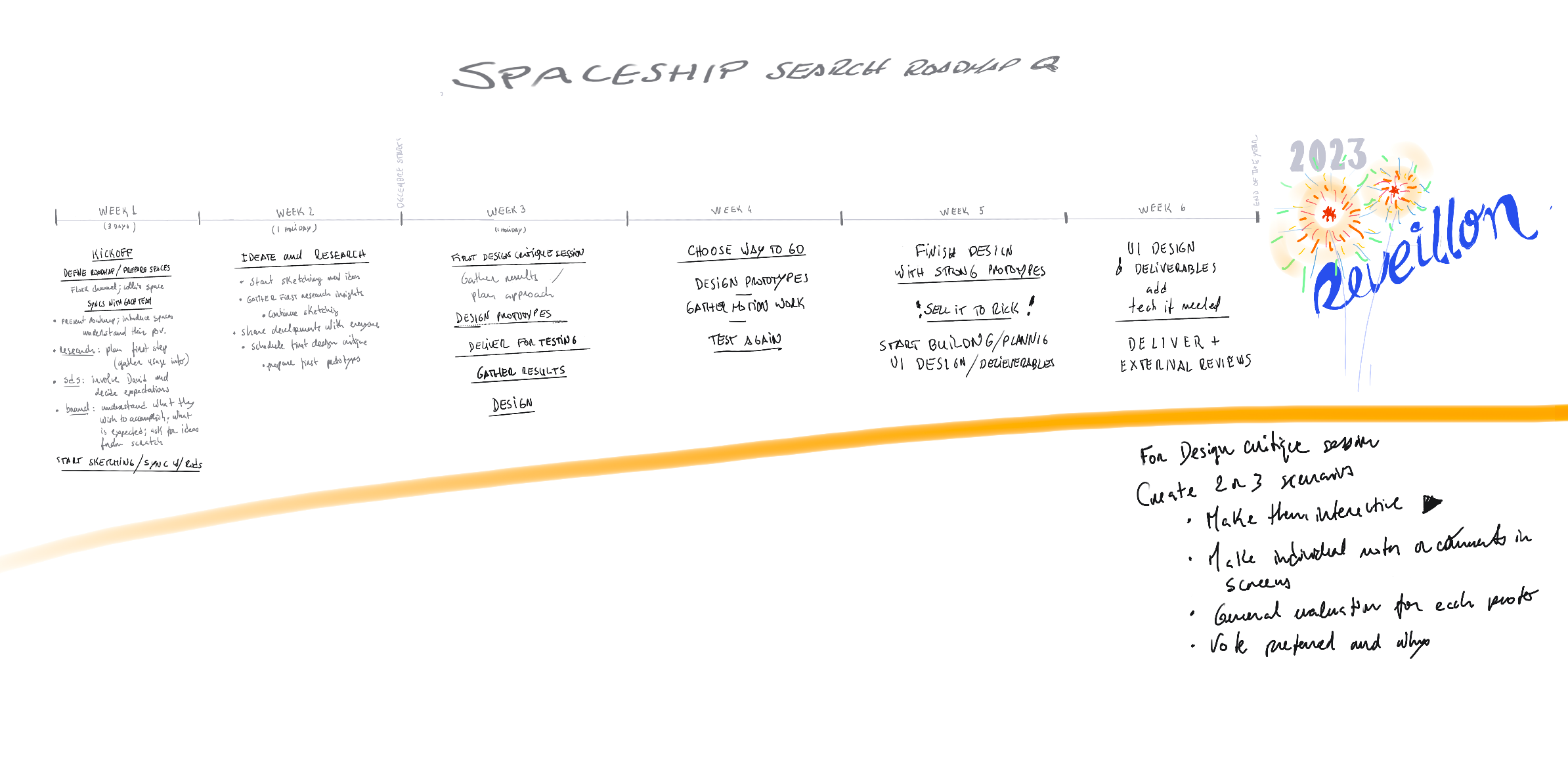
Now, teams were aligned, energized, and with a clear path for when to step in and contribute. Six weeks on paper—a bit longer in practice with the holidays sitting in the middle.
Exploration
Three directions, one conversation
Three designers worked the problem in parallel: myself, David, and Mafalda. We met first to talk it through and agree on a shared structure, then split off to prototype.
With the prototypes done, the next step was the Design Critique Session. The format was simple: a Figma file prepared in advance with all three directions, four designers invited from outside the project, and the prototypes shared a day early so they had time to sit with the work and take notes.

The design critique session
A rich session with pure design talk. No presenting. No defending. Four outside perspectives, one problem on the table. What came out of it was sharper than anything any of us had walked in with.
We left leaning toward David’s concept—An elegant progressive disclosure experience. I started building on it while the next stage was being set.
User testing
Testing the prototype
To be honest, testing with Figma prototypes is not ideal. They’re far from the browser experience. Especially when you have to input text.
Still, the sessions caught real things. The search/transfer confusion from Round 1 didn’t resurface once. But three of four participants looked for transfer in the navigation menu—not the search bar. One put it plainly: “It doesn’t seem normal to use a search input for a transfer.” The component worked. It just didn’t announce itself.
From the sessions I also picked up one interesting thing: participants weren’t focusing on the component as naturally as they should—that stayed with me as we moved forward.
Solution
What was shipped
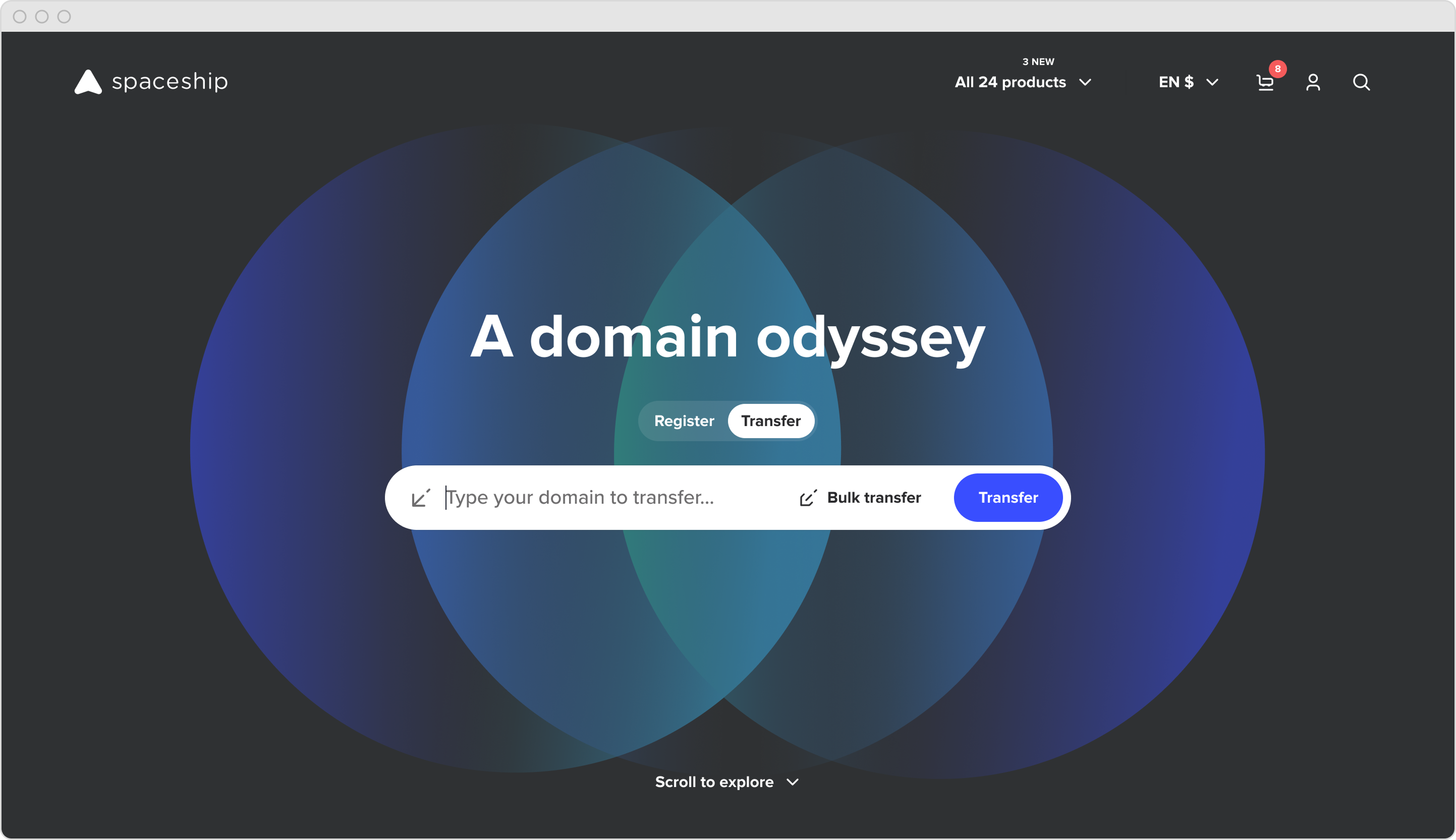
 The final homepage. Toggle always visible, modes immediately legible, transfer no longer accidental.
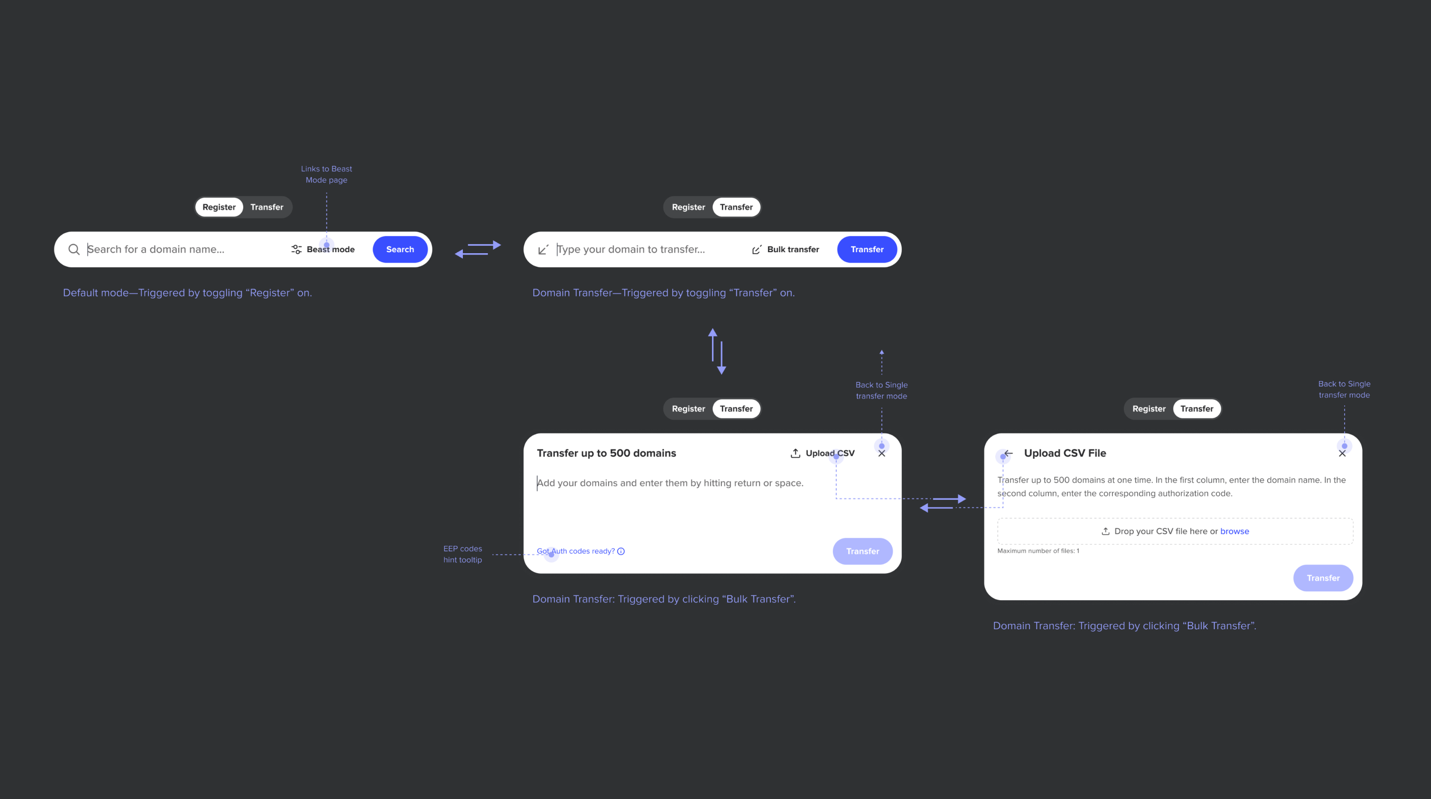
The component became a small system. Register stays simple: one input, one action. Switch to Transfer and the bar transforms: different placeholder, different CTA, a secondary path into bulk transfer. Go deeper and you get a modal handling up to 500 domains with CSV upload. Each mode shows only what it needs, nothing more. The navigation between them is tight—every state earns its place, and the path from a single search to a 500-domain bulk transfer is three clicks, not three pages.
The toggle that almost stayed hidden
The most important decision came last. During final delivery, we got everyone in the room (stakeholders included) and put the prototype back on the table. Something kept nagging. Then it clicked. The Round 2 signal we’d noted but moved past. “It doesn’t seem normal to use a search input for a transfer.” Same problem we’d set out to fix, just wearing a more elegant outfit. We were about to ship a hidden toggle because it looked cleaner. Users would still have to discover the mode. They’d still wonder what the component did before touching it.

The toggle moved outside the input box, front and centre. No disclosure, no expansion—just there. An added benefit: the surrounding content stays in place when you interact with it, because the input no longer needs to expand to reveal the mode switcher.
Less copy, more focus
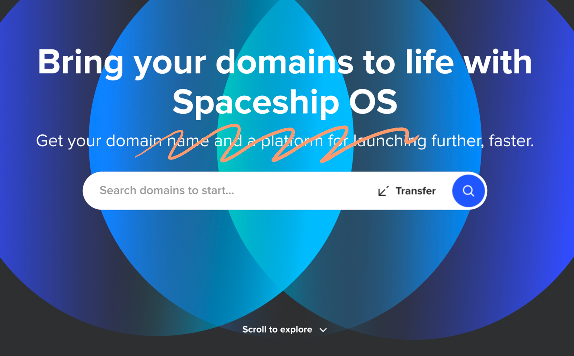
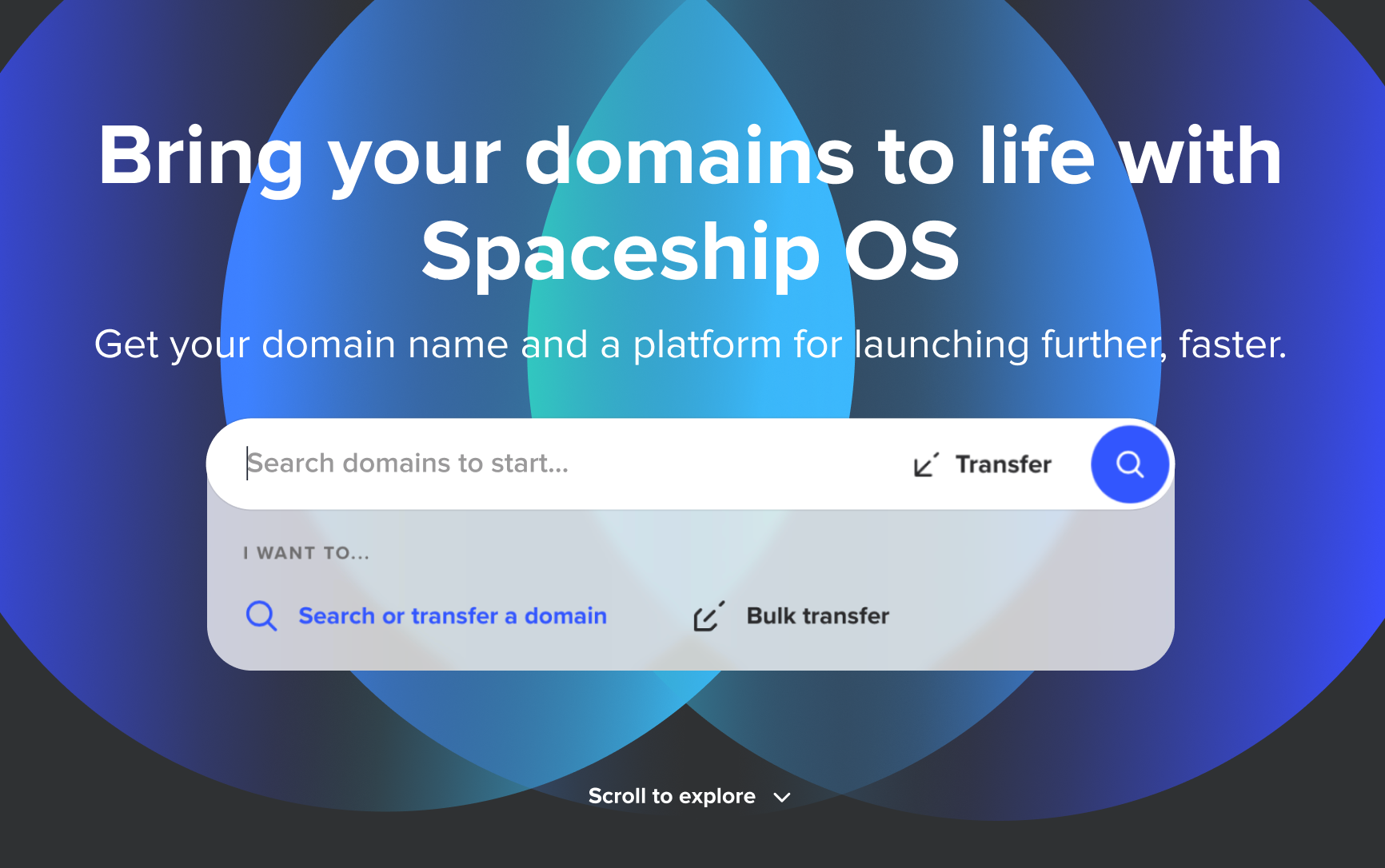
A subtitle sat above the input—“Get your domain name and a platform for launching further, faster”—saying nothing the rest of the page wasn’t already saying. SEO carries weight at Spaceship, and rightly so, but this line wasn’t earning its place. I pushed for it to go. The team backed me, and it shipped without.
The component had room to breathe. The eye knew where to land.
The background that steps back
That signal I mentioned earlier, about focus, stayed with me while designing the final artifacts.
The idea came from there: rethink the entry, give the component room to lead. I worked it through with Mafalda, our motion designer. The component arrives with the background. Then the background steps back, and everything else settles into place. The bar leads.
Beauty isn’t decoration here. It earns the focus. Beyond the entrance, we simplified bulk transfer mechanics, tightened error handling, and cleaned up micro-copy — small things that compound.
Outcome
Noise down, signal up
The design shipped April 2024. Weeks later, the BI team flagged an anomaly: widget interactions dropped 95%. It looked like a disaster.
It was the design working as intended.
Success rate (post change)
21%
↑ from ~5% (before Apr 12)
Transfer success rate quadrupled. Volume down, intent up. Fewer people reaching the widget, but the ones who did were actually trying to transfer, and succeeding.
A 95% interaction drop that quadruples success—noise disappearing, signal emerging.
Learnings
What it taught me
Research develops real empathy. Two rounds of usability testing, one on the live product, one on the prototype. The first surfaced problems. The second confirmed we’d actually solved them (and caught new ones we weren’t looking for).
Figma prototypes have a ceiling. They’re great for structure, terrible for feel. You can’t type, can’t feel weight, can’t land inside the real browser experience. We worked around it, but I walked away knowing that for interaction-heavy components, the prototype needs to get closer to the medium.
Clarity over elegance, every time. We almost shipped a hidden toggle because it looked cleaner. Then we caught ourselves doing the exact thing the project was supposed to fix. That moment—recognizing you’re reintroducing the problem you set out to solve—is design maturity. It’s not about being right. It’s about being honest with yourself while you’re still in it.
Fewer interactions can mean better outcomes. A 95% drop looked like a disaster until you paired it with a 4× increase in success. It’s a reminder that removing friction sometimes means removing access to the wrong path entirely.
Where it stands
The component is still there—untouched since April 2024. It also became a sharable component in the design system, reused across the site with contextual variations: register-only on some pages, transfer-only on others, the full toggle where both modes belong. One component, many homes.