Namecheap VPN — macOS app idle and connected states

A new product from zero to launch

Namecheap launched a VPN product in 2019. I was the sole UX designer on a newly formed team—the “New Product Pod”—responsible for two deliverables in four months: a macOS menubar app and the product’s marketing landing page. The app was the core challenge—a small popover window that needed to handle multiple connection states through a consistent layout system. The landing page organized a dense feature set into a single, navigable page.

Landing Page

Namecheap VPN landing page — full desktop view

Final desktop mockup — hero, pricing, features, and download sections on a single page.

VPN landing page content architecture and wireframe

Content architecture — mapping every section, entry point, and user flow before visual design.

VPN landing page user flow diagram

User flows — how visitors reach the VPN landing page from different entry points across namecheap.com.

Landing page overview — desktop and mobile views side by side

macOS App

Namecheap VPN macOS app — idle and connected states

The macOS menubar app — idle and connected states. A small window with a lot of responsibility.

VPN macOS app layout architecture with annotated zones

Layout architecture — five zones that stay consistent across every state: logo area, info, CTA, actions, and data footer.

VPN macOS app concept wireframe with numbered annotations

Concept document — numbered annotations mapping every element to its function and content across states.

System Elements

VPN toolbar icon states for classic and dark mode

Toolbar icons for classic and dark mode — regular, connecting, selected, active, warning, and error states. Plus notification icons and the app logo.

Process

VPN project team sync loop — full process with all roles

The sync loop — how the team worked. Kick-off with the PM, wireframes from me, copy and illustrations from the marketing team, mockups back to me, then frontend development.

About

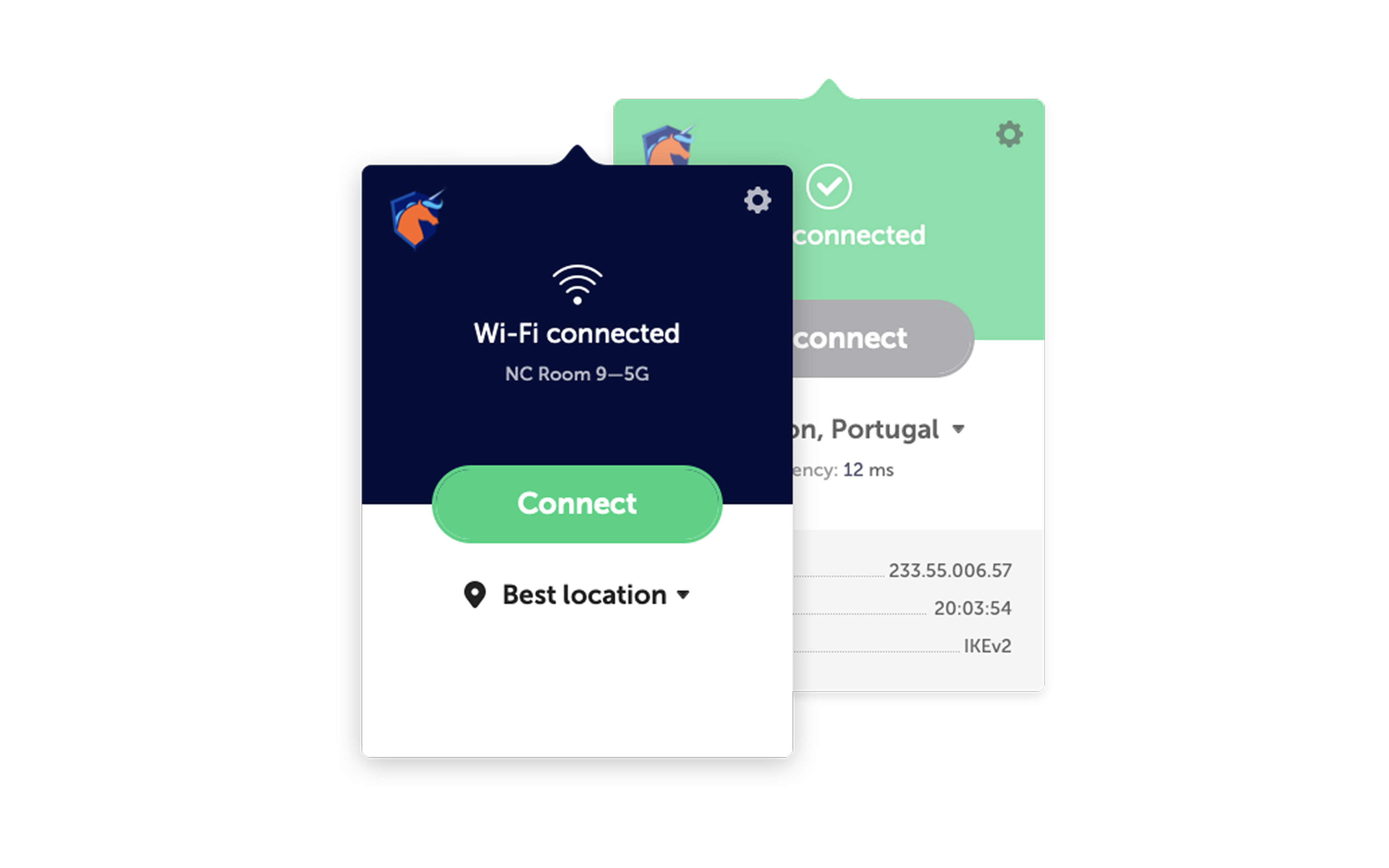
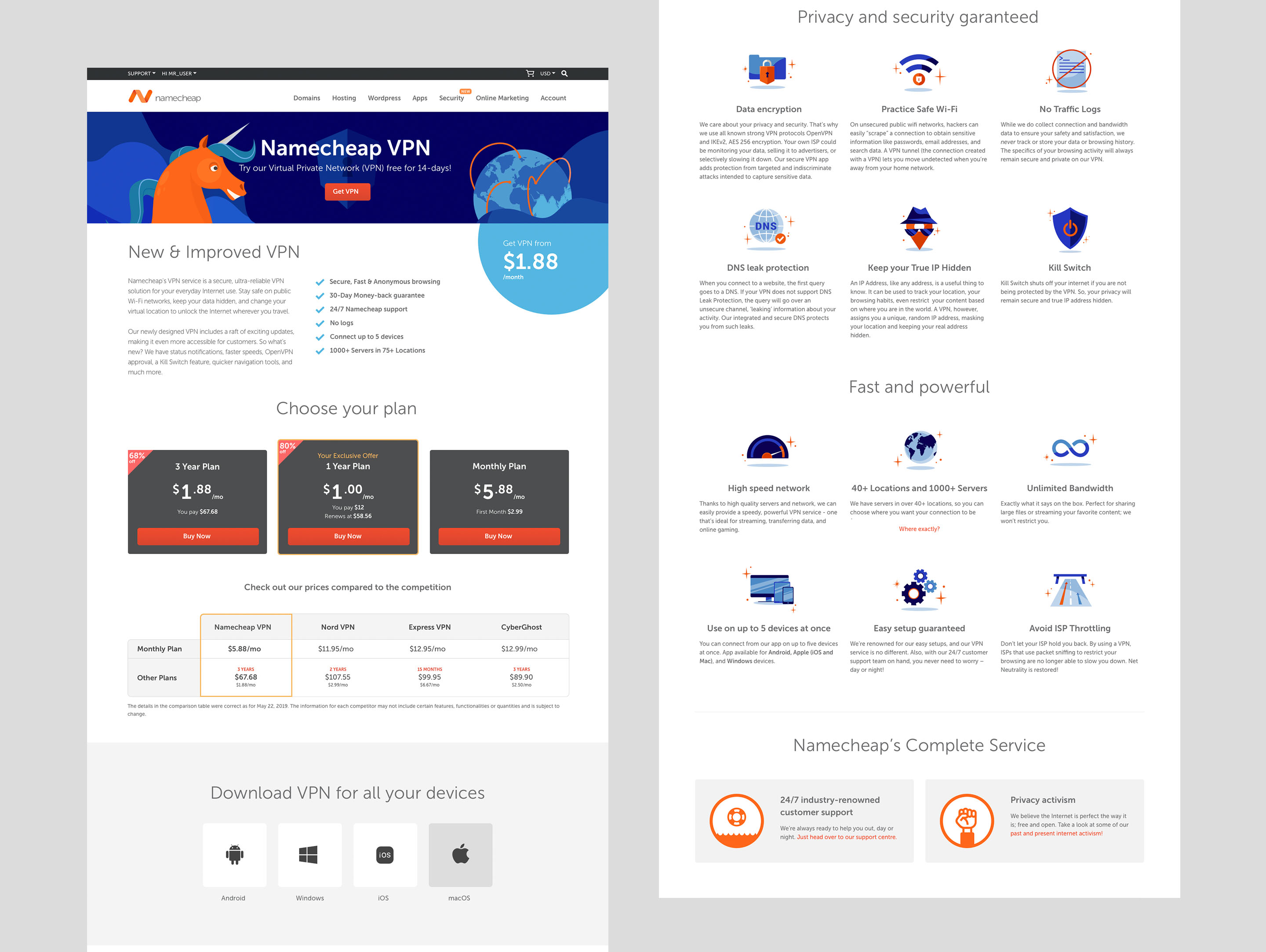
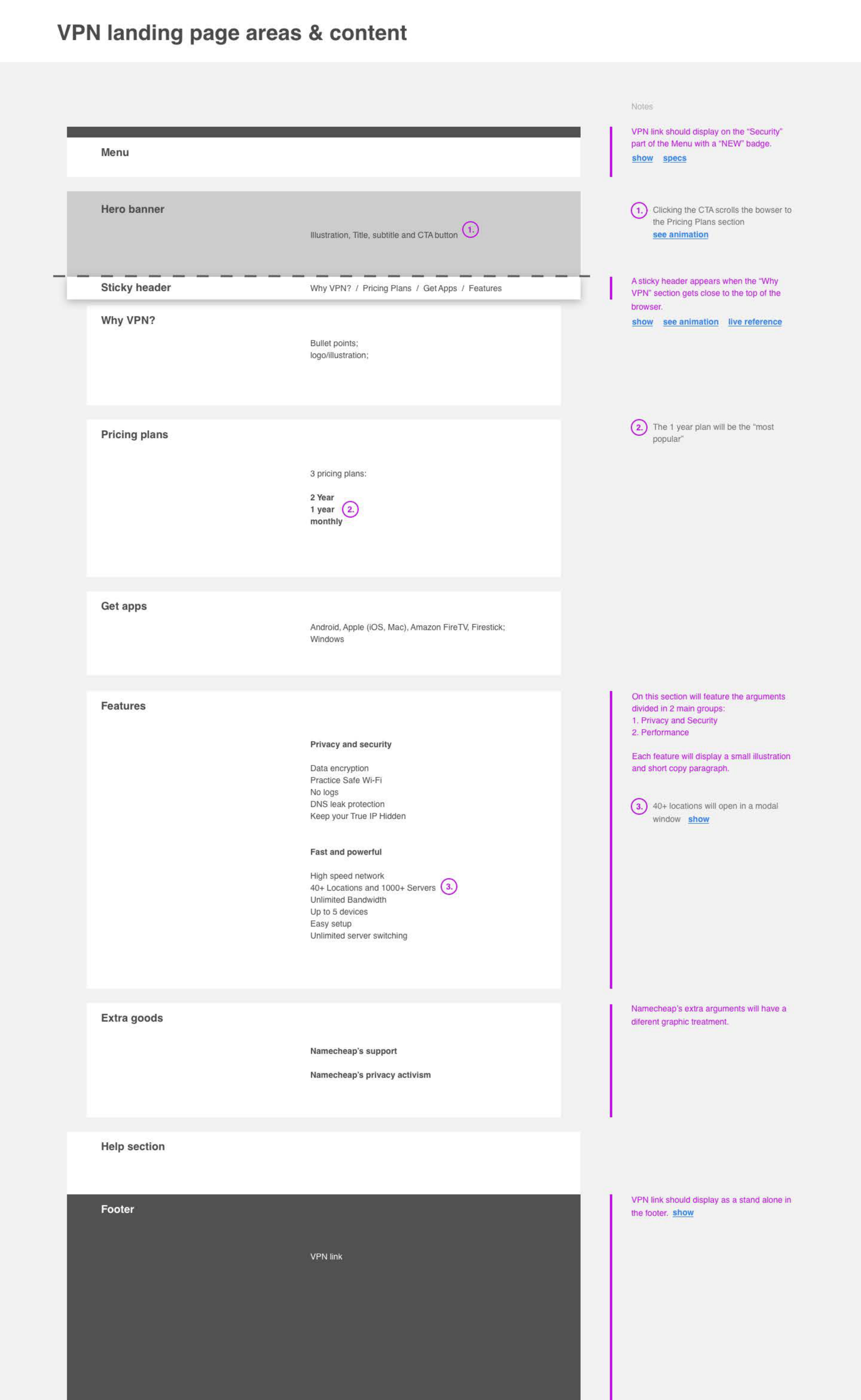
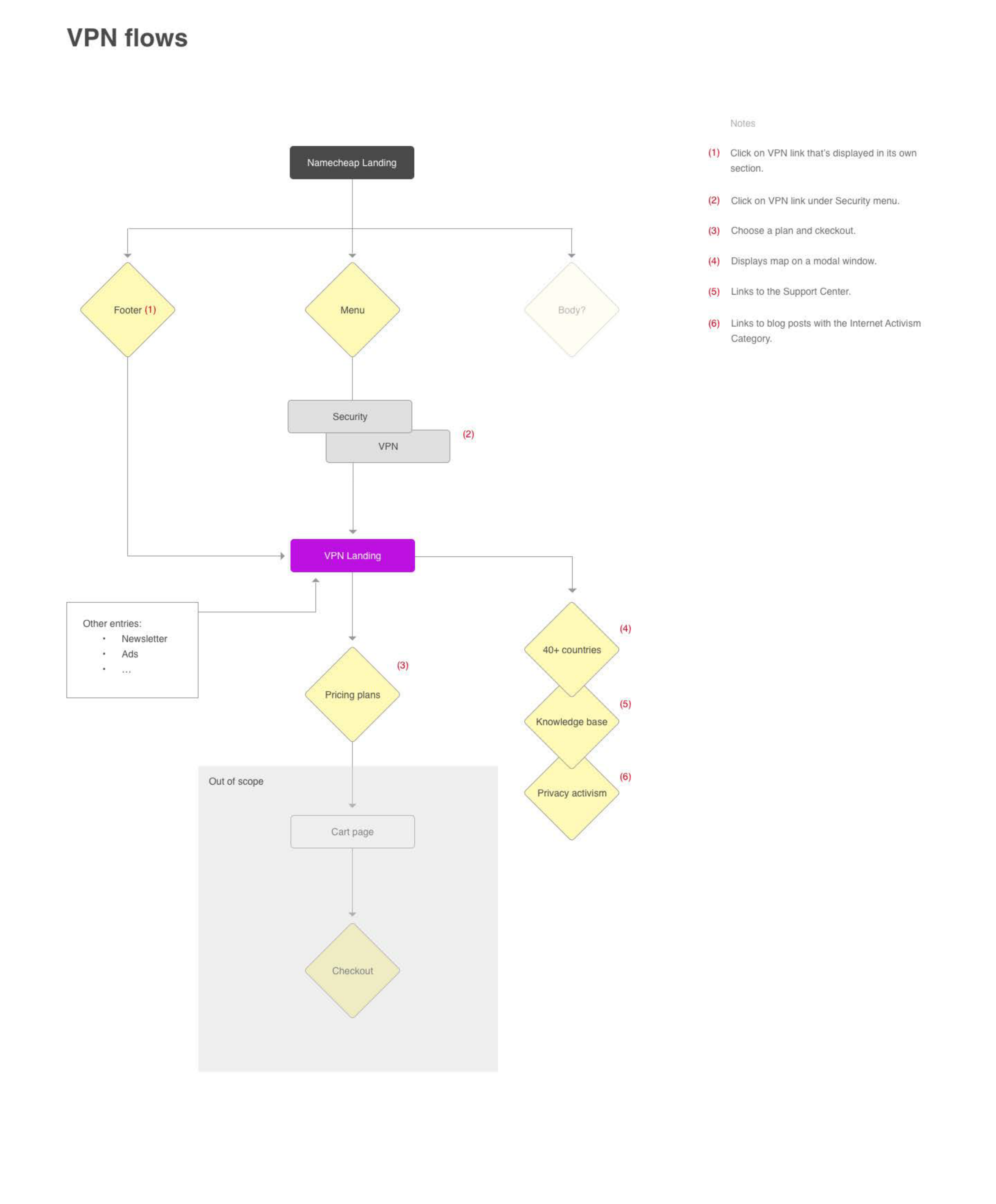
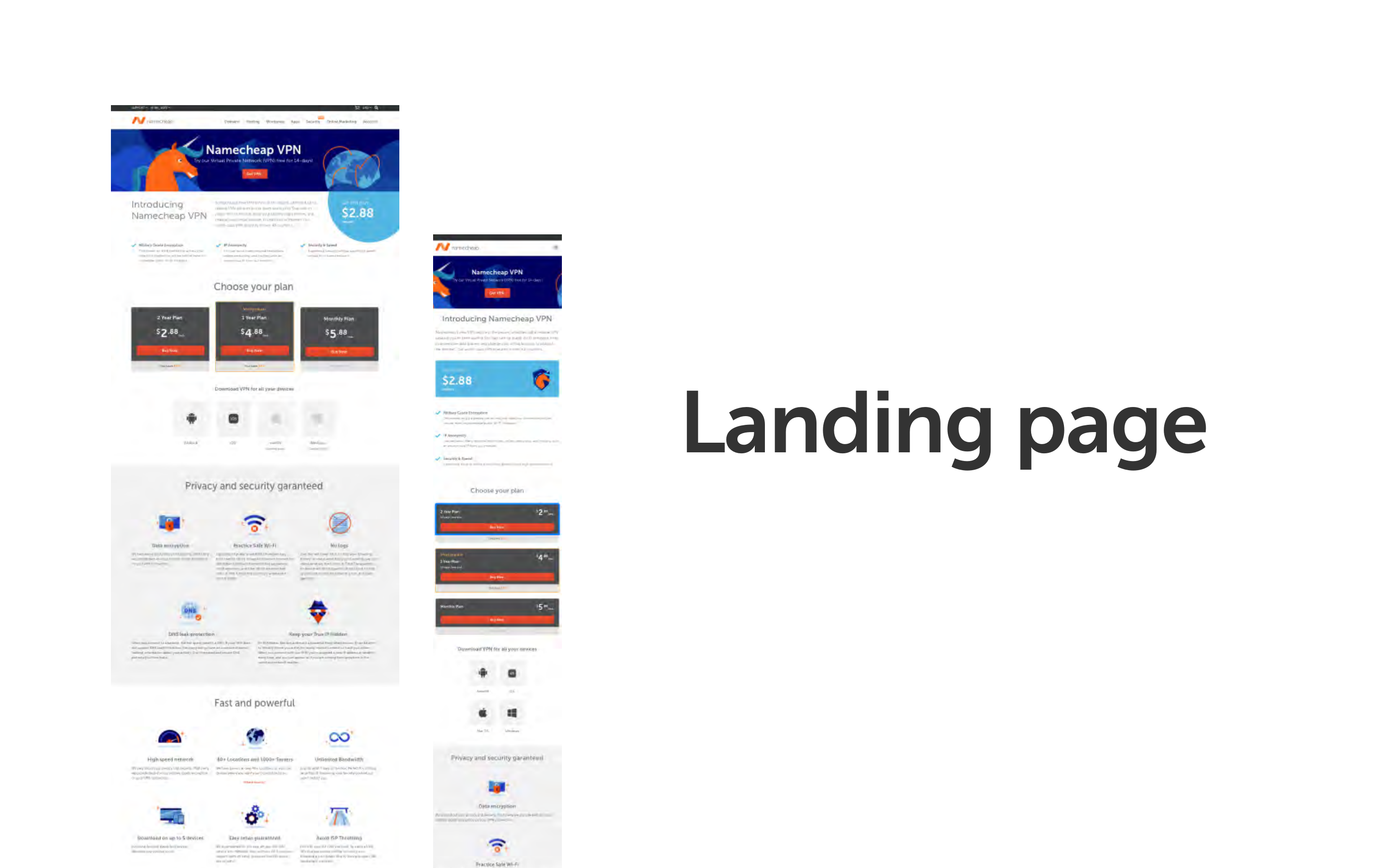
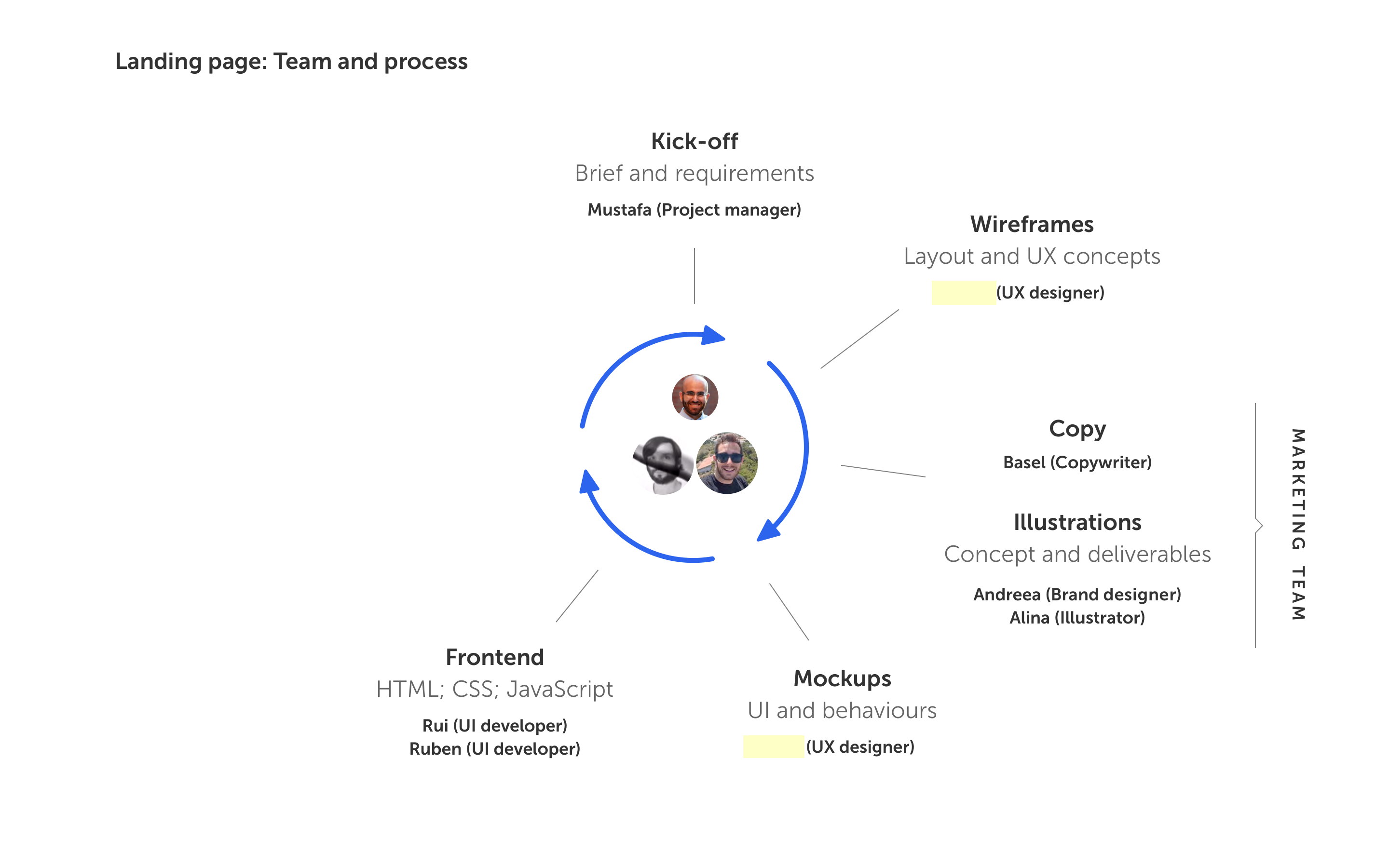
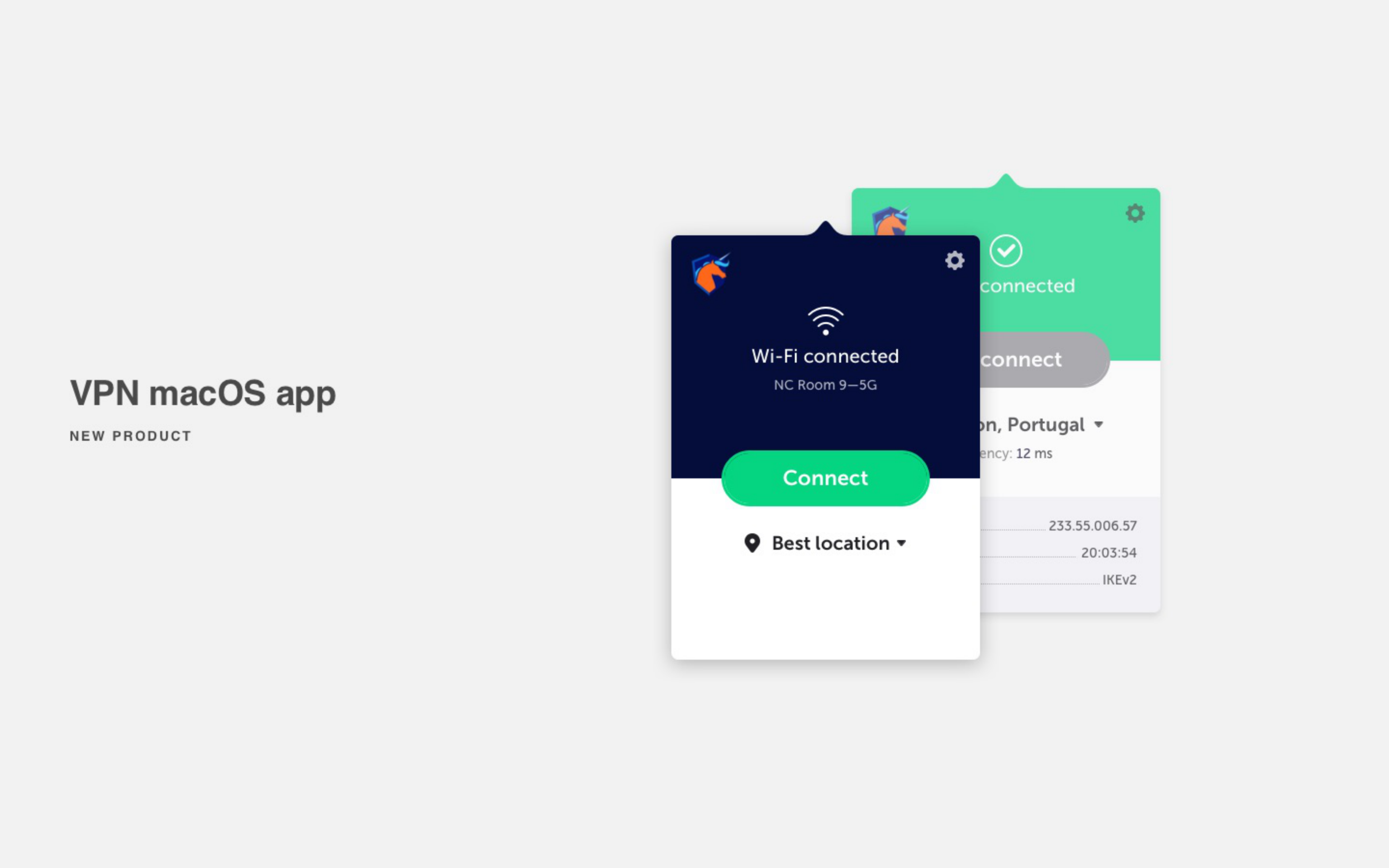
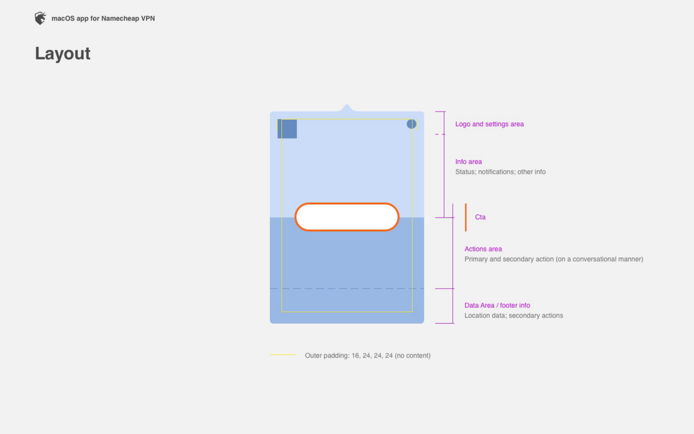
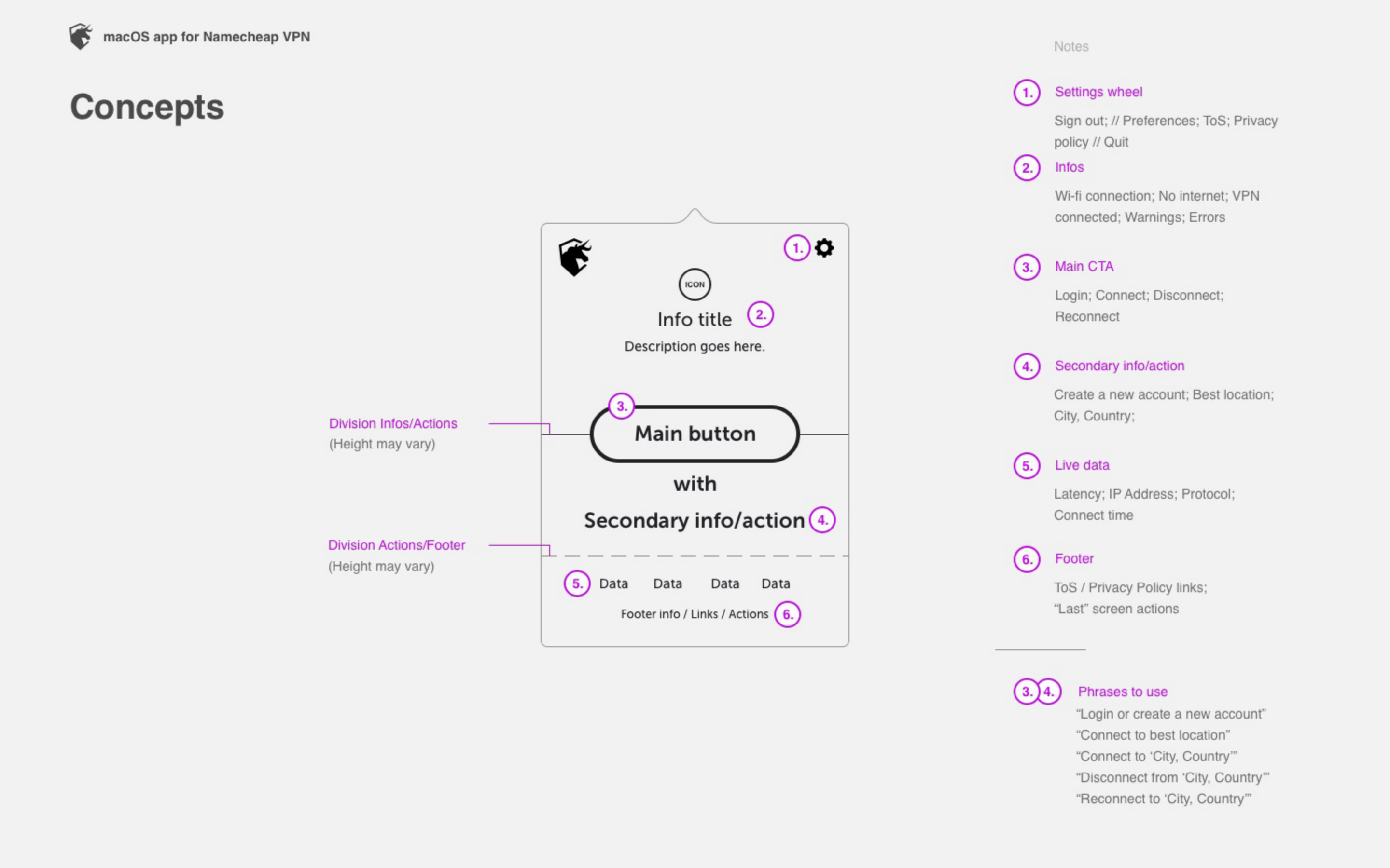
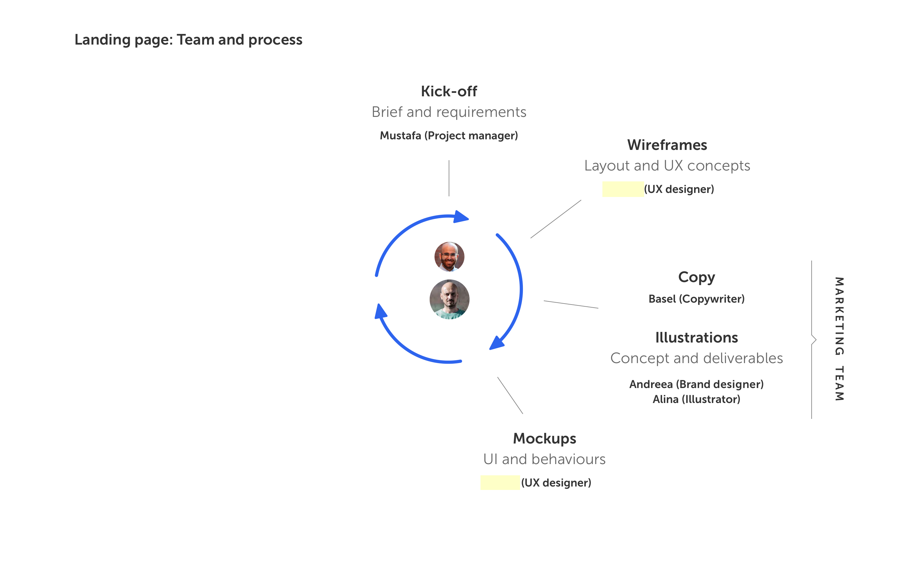
Namecheap launched a VPN product in 2019. I was the sole UX designer on a new team — the “New Product Pod” — responsible for two deliverables in four months: a macOS menubar app and the product’s marketing landing page.

The app was the core challenge — a small popover window handling multiple connection states through a consistent layout system. The landing page organized a dense feature set into a single, navigable page.

The product shipped on time, soft-launched successfully, and grew into a revenue line for Namecheap. The project was later presented to the full UX team as a reference for how to take a product from zero to launch.